Through a user-centered design approach, we identified various challenges pertaining to the current design of Craigslist. These challenges primarily related to the ease of use and aesthetics of the platform. The proposed redesign offers a modern, intuitive interface that reflects user input and interface evaluation standards while maintaining Craigslist’s original function. The design is created in regard to universal design and aims to be inclusive to people of all ages and people with various age-related cognitive declines.
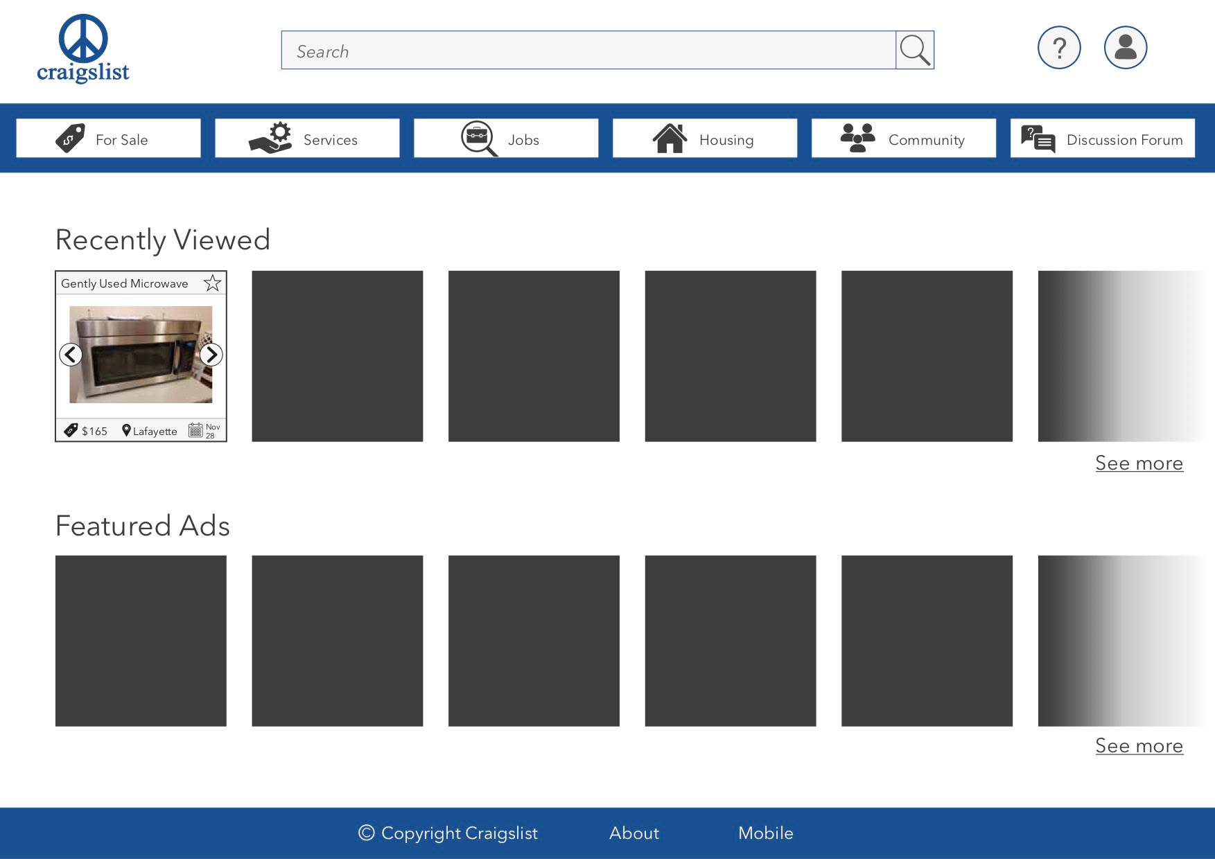
The design incorporates a ‘Help’ and a ‘My Account’ function in the top right corner of the page. These functions are illustrated with an icon that utilizes a familiar symbol, which helps ensure that the user knows which function is represented by which symbol. Additionally, the clutter of the existing design is significantly reduced by only displaying the main categories (seen in the task bar near the top) and hiding the sub-categories. The icons of the main categories allow for quick recognition of the category, which increases user friendliness, while the texts ensure that the user will be able to identify each category correctly even if the user is not familiar with the symbol used. The color has been modified from the jarring blue to a blue that is easier on the eyes. Simplifying the design of the page, reducing the clutter, and altering the color all contribute to giving the page a mode modern look.
A search bar has been incorporated at the top of the page to make it easily accessible for the user, as it is then more similar to most other websites with a search function (such as Google). The field has the word ‘Search’ written in it and furthermore has a magnifying glass as an icon - this way the user will be able to easily identify the function of the search bar. The contrast between the font and the background has been increased to make it more reading-friendly for the user. The reading-friendliness is also increased by using a simple font that is sans serif. Additionally, the user’s navigation on the page is facilitated by incorporating a ‘Recently Viewed’ and ‘Featured Ads’ section on the front page.
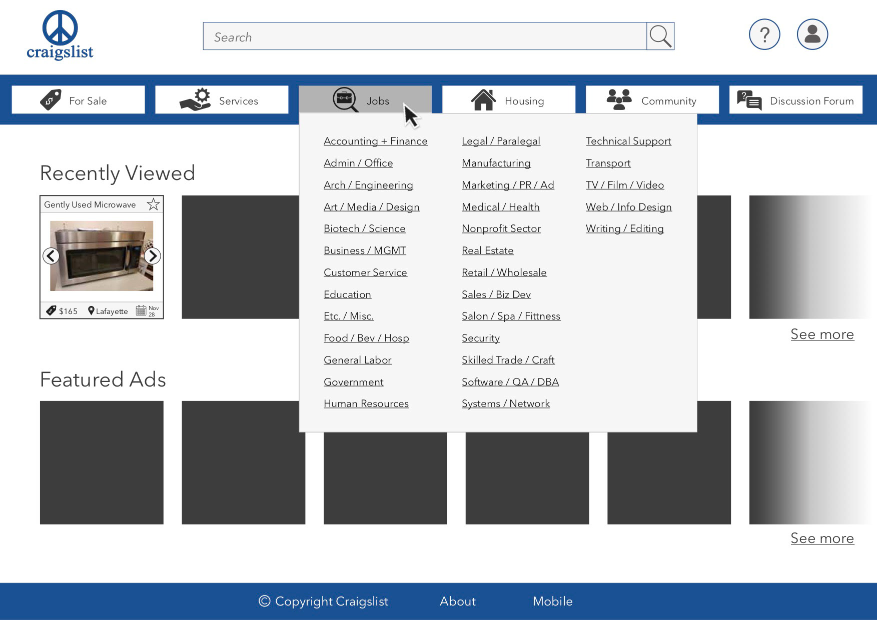
The sub-categories are displayed when the user is hovering over a particular category. This way, the page is easily navigable, and the user still has easy access to the sub-categories, but the clutter is reduced by not having them displayed unless hovered over. Reducing the clutter allows the user to be less overwhelmed and less likely to experience information overload when using the page. When hovering over a particular category, the box containing the category is highlighted in a darker grey. This gives a clear indication of system status and provides feedback to the user, who will be able to easily see where on the page he/she is and under which category.
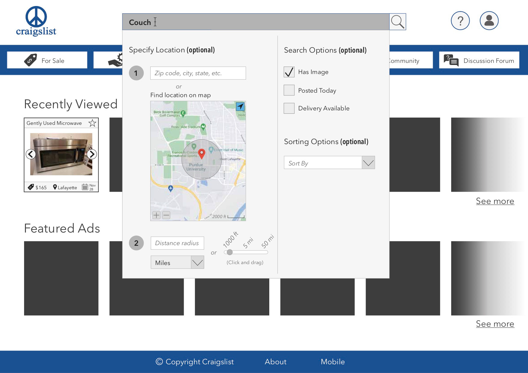
When typing in the search bar, the search field will be highlighted in a darker grey in order to give a clear indication of system status – similar to hovering over a category. Additional search filters are displayed in a box underneath the search bar, which are all clearly marked as optional. The first filter provides the user with an option to specify location, which consists of two steps. Clearly marking the two steps increases the user friendliness, as the user is guided through the process.
In the first of the two steps the user can either enter a zip-code, city, state, etc. or find a location on the map below. In the second of the two steps the user can specify a distance radius either by manually entering it or by clicking and dragging the point on the slide controller. Upon specifying a location and distance radius the map provides feedback for the user in the form of a graphical representation of the location. The second part of the search filters includes binary search options that the user can check off in the boxes. The check mark in the box provides a clear indication for the user regarding which search options are chosen and which are not. Lastly, the user is presented with a sorting option, which is created in the form of a drop-down list. When no sorting is chosen, the box displays the text ‘Sort By’ to further indicate the function to the user.
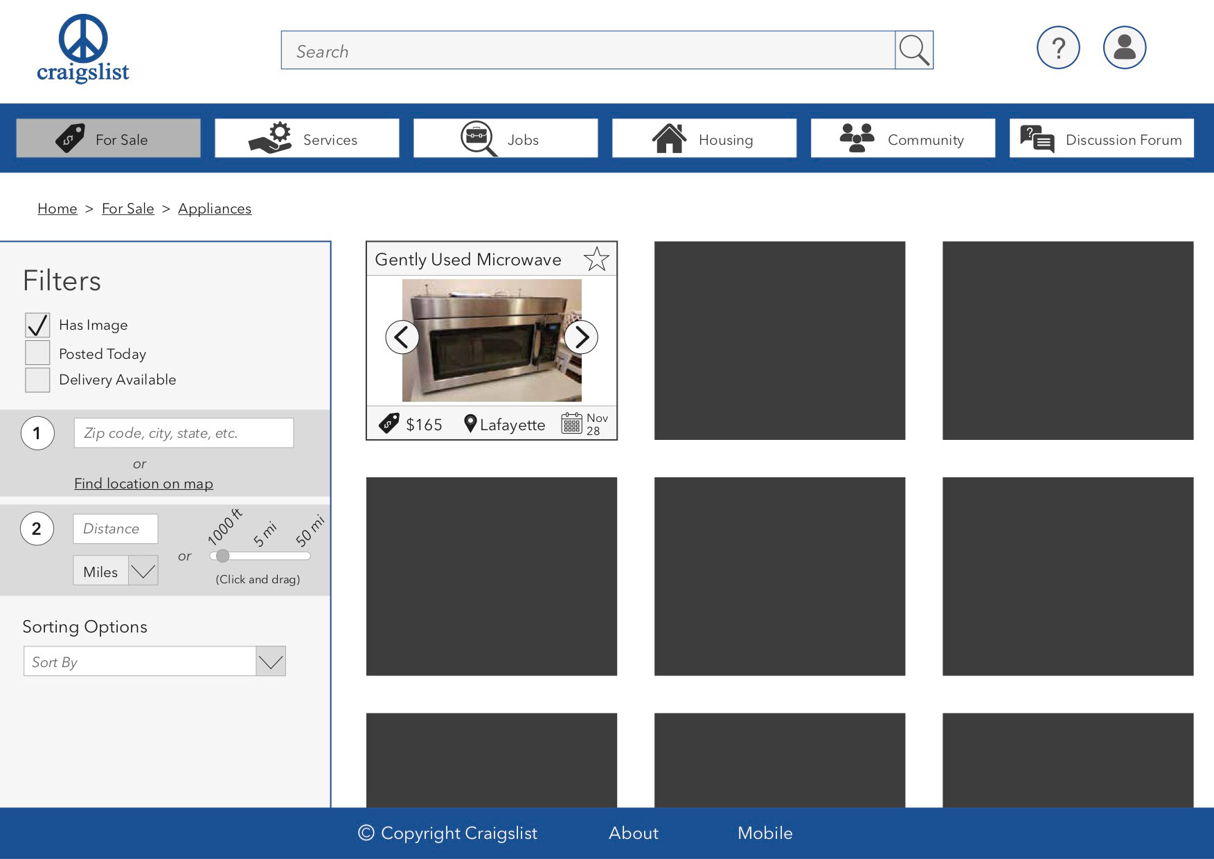
When a sub-category is chosen – in this case the category ‘For Sale’ and the sub-category ‘Appliances’ – the box containing the category is highlighted in dark grey in order to give the user an indication of the system status. Additionally, a path has been incorporated which shows the path from the home page to the current page. This path allows the user to easily identify where they are on the page and makes it easier to recover from errors and go back to previous pages. Filters are now displayed on the right side of the page, which includes the same options as the ones appearing when typing in the search bar. The intuitiveness is increased on this filtering tool by providing the user with the feedback described in the previous paragraph. Additionally, as it is similar to the system layout of the filters when typing in the search bar, the user can more easily and clearly refine their search. Lastly, the size of each classified ad is increased, which allows the user to more easily identify the displayed details of the ads.